
A Snack Ordering App for a Movie Theatre:
CineSnacks
Google UX Design Certificate
2023
In order to polish up my UX skills after several years out of the field, I enrolled in the Google UX Certificate course in July of 2023. For my main portfolio project, I chose the prompt:
"Design a snack ordering app for a movie theatre."
Using this prompt, I proceeded through Google’s UX process, from research, to ideation, testing, design, and iteration, to produce a high fidelity prototype.


Contents:
Preparation
-
Research
-
Empathy exercises
-
Structure
Design
-
Ideation
-
Wireframes
-
Low fidelity prototype
Testing
-
Usability test
-
Results
Iteration
-
High fidelity designs
-
Design system
-
High fidelity prototype
Next Steps
Reflection
My roles:
-
Research
-
Ideation
-
Design
-
Prototyping
-
Design system
Preparation
Research
The Google UX Certificate has students perform a competitive audit as the primary form of research: a strong choice for a limited budget.
Research goal: Compare food and drink ordering processes across a few select direct and indirect competitors.
Direct competitors
Cineplex Cinemas
Landmark Cinemas
Indirect competitors
Tim Horton's
DoorDash
Gaps:
-
Difficult to compare: No competitors offer an easy way to compare prices or nutritional information between options.
-
No favourites: While DoorDash offers a “past orders” view, no competitor allows users to build their own personal menu.
-
VIP Only: among direct competitors, only Cineplex offers pre-ordering, and then it is limited only to VIP experience cinemas.
Opportunities:
-
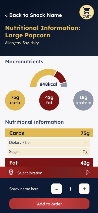
Allow users to easily access nutritional information to support users with dietary restrictions.
-
Give users the ability to build a personal menu of favourites.
-
Open snack pre-orders to all users, regardless of booking status.
Empathy Exercises
I completed two personas, user journey maps, and storyboards to get a better idea of users' needs when ordering movie snacks.
Maddie Yun
“I want to see everything! But I still need to slow down sometimes.”
Age: 24
Education: Bachelor's of Computer Science
Lives in: Montréal
From: Seoul
Lives with: her roommate
Goals:
-
Improve her comprehension of English and French
-
Relax and have fun during her time off work
-
Experience Montréal and Canada
Frustrations
-
Menu boards are difficult to read
-
Prices are not listed online, making budgeting and planning difficult
Richard Elliott
“My kids are my world—and sci-fi movies are my moon and stars.”
Age: 42
Education: Engineering Degree
Lives in: North York, Toronto
From: Calgary
Lives with: shares custody of two children with ex wife
Goals:
-
Spend quality time with his two kids
-
Keep an eye on his health
-
Engage in his hobby and favourite snacks
Frustrations:
-
No nutritional information available
-
Two kids have a busy schedule, so time is tight
-
Carrying snacks is difficult
Richard Elliott
User journey
1
Look over the menu
-
Get to theatre
-
Locate concessions
-
Stand somewhere unobtrusive
-
Read menu items
Neutral to irritated.
2
Look up nutritional info
-
Take out phone
-
Research snacks individually
-
Take screenshots of results
Frustrated, overwhelmed.
3
Compare to dietary requirements
-
Swipe back and forth between photos to check sugar, salt, and fat
-
Delete inappropriate options
Overwhelmed
4
Choose snack
-
Compare remaining options
-
Select most appealing option
Disappointed
5
Order snack
-
Wait in line
-
Order snack
-
Wait to pick up snack
-
Pick up snack
Anxious, rushed
Results:
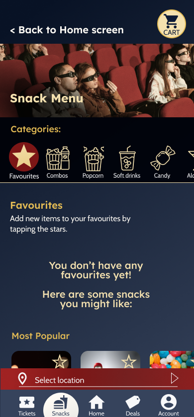
The CineSnacks app will help users like Richard by providing accessible nutritional information and allowing them to build personal menus.
Users with dietary needs, like Richard’s, face a complicated task when trying to order snacks. Nutritional information is difficult to locate, or may be located in large PDFs, making it hard to focus on particular snack items. Providing these users with both nutritional information to help them identify safe foods, and a favouriting system to help them track and remember those items, has the potential to improve these users’ experience while ordering snacks.
The CineSnacks app will let users save menu items to a personal list, which will affect users with dietary restrictions by allowing them to curate a selection of safe snacks for quick and easy ordering. We will measure effectiveness by tracking how many users use the favourites tool, and how often.
Structure
Using a user flow for the checkout process, I worked out the basic structure of the app.
User task: Use the snack app to build a personal menu based on nutritional requirements, and build an order from that menu.

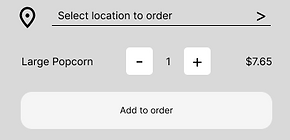
Based on the competitive review, as well as the flow, the app should have a persistent location selection bar to allow users to select their location at any point in the flow. To allow users to peruse the whole menu, and avoid interrupting their process, while also preventing users from ordering items that may be unavailable at their desired location, the user is prompted to select their location when adding an item to their cart.
Design
Ideation
Using a Crazy 8s exercise to get started, I quickly sketched paper wireframes of the main app screens to get a feel for what I wanted.


Wireframes
I translated the paper wireframes to Figma.
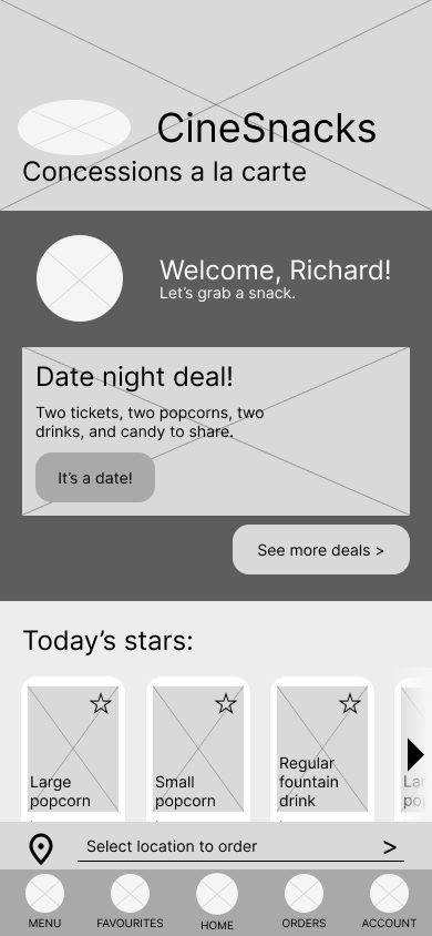


Low-Fidelity Prototype
In order to strengthen my prototyping skills, and to more accurately assess features, I made use of conditionals and variables in my low-fidelity prototype.
I focused on creating a clear visual language to help users navigate the app contents:
-
Strong 15px rounded-corners indicate a tappable item, while subtle 5px rounded, or square corners, indicate static imagery.
-
Cards partially cut off indicate horizontal scroll.
-
In-page links to other screens use an arrow to indicate motion.
-
Dark buttons show the main CTA, while lighter buttons show secondary CTAs, and text links show tertiary CTAs.

Accessibility considerations:
-
All buttons and icons are accompanied by text to clearly indicate their function.
-
Each section has a unique header image and title to create a sense of place.
-
Every screen has a clear link at the top to allow the user to navigate backwards, while overlays include two to three exit routes.
-
Main navigation is located at the bottom of the screen, where it is easy to reach.
-
CTA Buttons are a standard 270 pixels wide to allow thumbs to easily tap.
-
Buttons and checkboxes are a standard 44px high, as per WCAG guidelines, to allow for easy tap.
Testing
Usability Test Plan
Making use of the templates provided through the Google UX Certificate course, I planned, scripted, conducted, analyzed, and synthesized the data from a usability study.
As per Nielsen Norman Group’s recommendations, I planned a usability test with 5 participants.
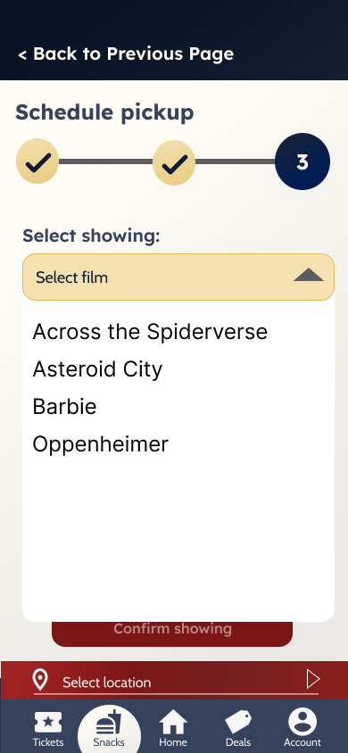
I prepared a script, sticking to open-ended and non-leading questions, and designed five tasks to test the basic desired functions of locating nutritional information, adding items to a favourites list, and scheduling an order.
Findings
Based on study results, there were some significant issues with the purchase funnel which needed to be rectified immediately.
4 out of 5 users navigated to multiple pages while attempting to add an item to their cart.
Most users were confused by having to select their location in order to add an item to their cart.
Therefore, the CTA on snack pages should be bigger and clearer, and allow users to add items to their cart regardless of whether or not they’ve selected their location.
3 out of 5 users expressed uncertainty that they had added something to their cart.
Most users felt lost during the add-to-cart process due to insufficient messaging.
The add-to-cart process must include clear messaging and feedback throughout to reassure users that they have added an item to their cart.


3 out of 5 users felt their location should be selected for them by connecting to their movie ticket purchase.
Most users experienced friction when asked to enter their location because they weren’t expecting this step.
Therefore, the app should be bundled into the ticket-purchasing app for the cinema chain, allowing increased cross-functionality and simplifying the process of scheduling snack orders.


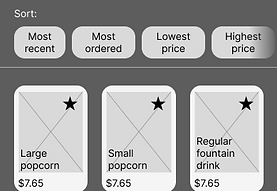
4 out of 5 users easily added an item to their favourites list.
The star icons used to indicate favourites are easy to understand and use.
Therefore, this feature is already strong, and can be further strengthened by adding a message to the favourites screen to help less technologically literate users operate the feature.

The Hard Truth:
Based on my early testing and conversation with users, as well as further research, the hard truth is that this concept should be a browser-based app, not a mobile app. At least at first!
One user expressed incredibly strong negative feelings towards the idea of downloading an app to pre-order snacks, regardless of whether or not it is connected to the ticketing app.
Based on 2020 data from HubSpot, every generation shows strong preference for purchasing through a company's website over purchasing through an app. This makes sense: despite what companies like JMango—whose business is building retail apps—might claim, the reason apps show a higher conversion rate is likely due to the fact that users who are dedicated enough to a brand to download an app are already high converters. Apps, therefore, likely funnel high converters into one place, and will be more valuable in increasing engagement among dedicated users over attracting new or casual users. Given that 18% of moviegoers accounted for 55% of ticket sales in Canadian cinemas in 2019, an app may be a valuable investment—in the future.
There are definite business advantages to a dedicated app which should not be ignored. Improved analytics, personalization, and push notifications are useful tools to have on hand.
For these reasons, CineSnacks should start its life as a browser-based experience in order to minimize cost and increase refinement before considering porting it into a dedicated app. Further research is required to determine the actual value of investing in a dedicated app.
However, as this is a requirement for the Google UX Design Certificate, I carried on with the app concept, re-envisioning it as just one section of a complete cinema app.
Iteration
Design Choices
Paying close attention to the content of the app, I chose colours and fonts that evoked the nostalgia and drama of going to the cinema.

I selected colours with strong connections to the movie theatre. Dark blue-greys to mimic the dark house, golden-yellows like popcorn, and the rich reds of classic cinema seating and red carpets.

For fonts, I chose a bold sans-serif reminiscent of classic movie posters, and a simple, readable sans-serif for content. I paid attention to the shapes of the a and g characters, choosing distinct shapes for titles and content, but which echo the clean, even lines and rounded shapes of the headers.
Interaction Design
Selecting appropriate transitions and crafting animations helps create a mental map for the user, and adds feedback with a spark of joy.
I added animations to imply direction: screens swipe in from right to left to indicate forward progress, and swipe out from left to right to indicate backwards movement. Meanwhile, the location selection pops up from below in an overlay, reflecting its presence across many screens, while the card slides down from above to imply that it is always there, just above the page, where the cart button is.
Additionally, I added animation to some elements, to help provide visual feedback and a touch of delight.


Next steps
As per the Google UX Certificate curriculum, the next steps are:
-
Perform a second usability study
-
Iterate on high-fidelity designs
-
Complete designs
-
Prepare design documentation
-
Complete a case study
As of 11 August, 2023, testing of the high fidelity prototype is underway.